The Market Trends Report (MTR) provides current and historical market trends at fine levels of geography. The MTR provides general local market trends information and is not an appraisal or valuation report.
Preparing Report
Terms of Use Privacy Policy FAQ Market Trends Report Sources and Methodology
The purpose of this report is to provide a clear and accurate understanding of the trends affecting the market price and intrinsic value of the subject property, the subject’s neighborhood, and its broader market areas.
-
Subject property:
- Subject property address:
- County:
- State:
- Zip:
- Subject census Tract:
- Absolute Subject Property Walkscore®: ®
- Absolute Census Tract Walk Score:
- Relative Census Tract Walk Score:
- Absolute CBSA Walk Score for :
- Date prepared: 01/23/2026
- Property price:
- Price tier based user provided price ():
Intrinsic Home Value refers to the value of a home determined by analyzing fundamentals without reference to its market price. The first three charts relate house price appreciation associated with the subject property to construction costs, wage growth, and rents to house price appreciation. The fourth chart relates the subject property’s house payment to its rental value, which provides a measure of its ability to earn its way out the mortgage debt.
- Construction costs
- Wage growth
- Rents
- Housing payment to rental value (relevant to the low and low-medium price tiers which are at entry level price points and demand comes largely from first time buyers)
Speculative elements drive up the market price to a level well above the intrinsic value. This higher market price relative to intrinsic value should be considered by the lender as speculative elements enhance the risk of loss should the price recede closer to intrinsic value.
- Supply/demand (month’s inventory at current sales rate)
- Constant quality home price appreciation
- Mortgage risk
- Weekly interest rate trend
- New construction sales as a share of all sales
Price Tier Cutoffs through for
Source: AEI Housing Center
Trends Used to Observe Deviations between the Subject Property’s Market Price and Its Intrinsic Value
Intrinsic Home Value refers to the value of a home determined by analyzing fundamentals without reference to its market price. The first three charts relate house price appreciation associated with the subject property’s price tier to construction costs, wage growth, and rents. The fourth chart relates the subject property’s house payment to its rental value, which provides a measure of its ability to earn its way out the mortgage debt.
- Construction costs
- Wage growth
- Rents
Construction Cost Index and Constant Quality Home Price Appreciation Index for 's Low Price Tier
Source: CoreLogic; AEI Housing Center
Wage Growth Index and Constant Quality Home Price Appreciation Index for 's Low Price Tier
Rent Index to Constant Quality Home Price Appreciation Index for ’s Price Tier:
Source: Zillow.com; AEI Housing Center
Trends Used to Evaluate if Speculative Forces Are Present
Speculative elements drive up the market price to a level well above the intrinsic value. This higher market price relative to intrinsic value should be considered by the lender as speculative elements enhance the risk of loss should the price recede closer to intrinsic value.
- Home sales trends
- Supply/demand (month’s inventory of existing homes at current sales rate of existing homes)
- Constant quality home price appreciation
- Mortgage risk
- Weekly interest rate trend
- New construction trends
Public Record Monthly Home Sale Share by Price Tiers:
Source: AEI Housing Center
Supply/Demand Analysis: Ratio of month’s remaining inventory of existing homes at current sales rate of existing homes ( in Low Price Tier)
Source: Zillow.com; Realtor.com; AEI Housing Center
Constant-quality Home Price Appreciation (HPA) Trend ( in Low Price Tier)
Note: The public records used for this report are based on over 3,000 county recorders of deeds with different data processing times (data latency). When data latency is high, the HPA for the more recent time periods can be noisy and may get revised in subsequent months as more data become available. This is especially the case in the high price tier, where sales counts are generally low. The same issue applies to home sales numbers.
Source: AEI Housing Center
Mortgage Risk Trends by Tier ( in Low Price Tier) The combination of high leverage and a tight housing supply can allow speculative elements to drive up the market price to a level well above the intrinsic value.
The public records used for this report are based on over 3,000 county recorders of deeds with different data processing times (data latency). For the Stressed Mortgage Default Rate (MDR), which combines many different datasets and therefore compounds the latency issue, generally the most recent time period is noisy. In addition, due to data reporting, Texas and New England are experiencing odd swings in the MDR. We are aware of the problem and are working with our data providers to fix this issue.
Source: AEI Housing Center
Average Annual Sales Volume

Mortgage Risk and Home Price Appreciation Trends by Census Tract for County
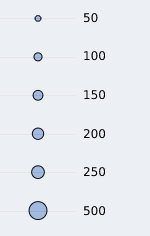
Note: The color of the bubbles is due to overlaps, rather than other statistical meanings. Each dot represents one of the census tracts with at least 2 sales in 2012. Tract bubbles and trend line are weighted by average annual sales volume. City is currently not shown on the chart as it is manually absorbed into the county.
Source: AEI Housing Center
Weekly Interest Rate Trend The combination of declining interest rates and a tight housing supply can allow speculative elements to drive up the market price to a level well above the intrinsic value.
Freddie Mac, 30-Year Fixed Rate Mortgage Average in the United States [MORTGAGE30US], retrieved from FRED (Federal Reserve Bank of St. Louis) , January 23, 2026.
New Construction Sales as a Share of All Sales: (2012 ~ 2018) Inadequate additions to supply can exacerbate a tight housing supply which can allow speculative elements to drive up the market price to a level well above the intrinsic value.
New construction trends
New Construction Sales as a Share of All Sales:
Source: AEI Housing Center
New construction as a share of all housing stock (2012-2023)
National Share Over the Period: 5.6%
Share Over the Period:
Census Tract of the 's %
%
,
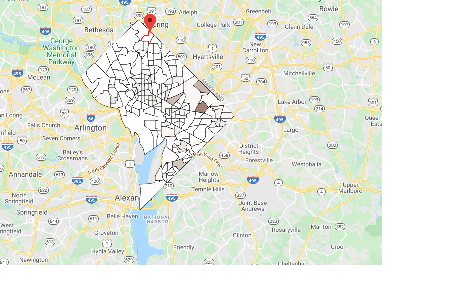
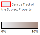
Heat map of New Construction Sales 2023 : Entry Level
2023: Move Up
2012: Entry Level
2012: Move Up
New Construction Sales – Comparison across years
Note: Columns may not sum to 100% due to rounding. For cash sales in non-disclosure states, we are sometimes unable to impute a sale price. Such sales are reflected in the overall total, but not in the entry-level or move-up segment, which may therefore not sum to the overall. The public records deed data are sometimes missing records, as discussed in the methodology. We do not publish results for counties for which the weight is larger than 5, which implies sales coverage of less than 20% and which affects less than 1% of sales.
Source: AEI Housing Center


Methodology:
Walk Score®:
Absolute Subject Property Walk Score: provided by Walkscore.com. It represents absolute walkability using walk score categories calculated nationwide in a uniform fashion. Absolute Census Tract Walk Score: provided by Walkscore.com. Census Tract Walk Score are “population weighted based on home locations within each tract” according to Walkscore.com. Relative Census Tract Walk Score: the census tract’s percentile walkability relative to the CBSA. Absolute CBSA Walk Score: derived from the Census Tract Walk Score. It is the weighted (based on number of properties in the tract) average Walk Score for the CBSA.
Rent Index
Data on the ZIP level Rent Index come from Zillow Observed Rent Index (ZORI). We average the monthly index to quarterly to reduce the noise. If the ZIP level Rent Index is not available, we then use the county weighted (based on the ratio of residential addresses in the ZIP) median rent index. Data are from 2015 to the most recent quarter and are indexed to 2015Q1.
Price Tiers and Price Segments:
Housing policies, new construction activity, and access to leverage can create very different home price appreciation trends depending on price tier. For this reason, this report distinguishes between different price tiers based on leverage.
The 4 price tiers are defined as follows:
- Low: all sales below the 40th percentile of FHA sales prices
- Low-medium: all sales at or below the 80th percentile of FHA sales prices
- Medium-high: all sales at or below 125% of the GSE loan limit
- High: all other sales
The entry-level segment consists of the low and low-medium price tiers and the move-up segment consists of the medium-high and high price tiers. We estimate quarterly price tier cutoffs using the FHA Snapshot dataset and FHFA’s loan limits at the metro level. When there are fewer than 50 FHA loans in a quarter, we pool all FHA loans at the non-metro state level. For the demarcation between medium-high and high tier, we multiply a county’s loan limit by 1.25 to account for an 80% LTV, which is the median LTV of loans taken out at the loan limit.
Home Sale Methodology:
Public record monthly home sale counts come from public records data at the county level. They generally tend to be somewhat underreported, or in some cases, substantially underreported or missing, for the most recent months due to a lag in recording a sale relative to the actual date of sale (“latency”).
Data are from 2012 to the most recent completed month, and overall counts cover an estimated 90% of the home purchase market. For a more detailed description, please see “Market Trends Report Sources and Methodologies”.
Months’ Supply
Data on housing inventory come from Zillow.com, Realtor.com, and Public Records. Months’ supply is calculated by dividing the total number of existing home listings by the total number of existing home sales. Months’ supply prior to June 2016 uses data received from Zillow.com; months’ supply for July 2016 onwards is calculated using monthly active listing counts received from Realtor.com and existing home sales from Public Records. Existing home sales for the most recent months are adjusted using HMDA and Optimal Blue to account for latency issue in the Public Records.
Home Price Appreciation (HPA):
We measure the cumulative HPA since 2012. The HPA is a "quasi" repeat sales index with a hedonic element. The index measures HPA by constructing an artificial sales pair consisting of one actual sale and one "artificial" sale as measured by the property's Automated Valuation Model (AVM.) The AVM approximates a property's sale price at a given point in time. The AVM used is unbiased and accurate. For more on the methodology, please see: http://www.aei.org/home-price-appreciation-index-and-months-remaining-inventory/
AEI Stressed Mortgage Default Rate:
The AEI Stressed Mortgage Default Rate is a hypothetical risk index, which measures how the loans originated in a given month would perform if subjected to the same stress as in the financial crisis that began in 2007. This is similar to stress tests routinely performed to ascertain an automobile’s crashworthiness or a building’s ability to withstand severe hurricane force winds. For more on the methodology, please see: https://www.aei.org/wp-content/uploads/2021/07/Housing-Risk-NMDR-methodology-July-2021.pdf?x91208
New construction sales:
We identify new construction sales primarily from the public records and fill in data gaps using Zillow data and/or listings data. We rely mainly on the Year Built variable in the Assessor data. If the Year Built is missing, we check the seller name against a database of around 500 builders names and search for key words associated with builders. If this fails, we check whether Zillow has information about the property’s Year Built or its Use Code, which helps us determine the new construction status. If we cannot ascertain any information about the property, we mark it as an existing home. These data help us determine the new construction status. We only count the first sale of a home as a new construction.
We have undertaken a rigorous quality control process of random sampling and checking of new constructions and existing homes using Zillow data, Google street view and satellite images. We find around 2% false positives and 1% false negatives. There is an estimated 1-2 months lag with this methodology. We also fail to identify owner-built homes without a long lag.
The new construction flag allows us to monitor new construction sales at the property level, as well as accurately estimate new home sales at fine geographic levels.
New construction contribution (% as of Stock) measures the share of newly constructed homes between 2012:Q1 and 2023:Q4 in relationship to the total single-family housing stock for which data are available. New construction contribution (% as of Sales) measures the share of new construction sales as a percentage of all home sales between 2012:Q1 and 2023:Q4
New construction heat map:
In some instances, the tax assessor records are missing the geo-coordinates of homes or the tax records are missing entirely for newly constructed homes which have not yet been assessed. This eliminates around 3% of new construction sales, with recent years being slightly more adversely affected. Therefore, the heat map slightly understates new construction sales relative to the new construction statistics table. We further eliminate another 5% of new construction sales due to coverage issues in the public records deed file, which can arise from latency or data collection issues. We check for coverage using home sales totals described above. The median coverage is 93% and the 99th percentile is 42%. When the understatement is greater than 50%, a county’s heat map for that year will be blank. Likewise, a county’s heat map will be blank for outlier years, for which the public records coverage falls outside a certain coverage band for other years.
Virginia State enclaves:
We account for low sales counts in Virginia independent cities and some smaller counties by combining these entities with their surrounding counties. The housing market indicators in these entities are the combined average of the smaller and the larger absorbing county. The table below shows all the changes:
| Independent city or small county: | Absorbing county: |
| Bristol, VA | Washington, VA |
| Buena Vista, VA | Rockbridge, VA |
| Charlottesville, VA | Albemarle, VA |
| Colonial Heights, VA | Chesterfield, VA |
| Covington, VA | Alleghany, VA |
| Emporia, VA | Greensville, VA |
| Fairfax City, VA | Fairfax, VA |
| Falls Church, VA | Fairfax, VA |
| Franklin, VA | Isle of Wight, VA |
| Fredericksburg, VA | Spotsylvania, VA |
| Galax, VA | Carroll, VA |
| Harrisonburg, VA | Rockingham, VA |
| Hopewell, VA | Prince George, VA |
| Lexington, VA | Rockbridge, VA |
| Manassas, VA | Prince William, VA |
| Manassas Park, VA | Prince William, VA |
| Martinsville, VA | Henry, VA |
| Norton, VA | Wise, VA |
| Radford, VA | Montgomery, VA |
| Roanoke City, VA | Roanoke, VA |
| Salem, VA | Roanoke, VA |
| Staunton, VA | Augusta, VA |
| Waynesboro, VA | Augusta, VA |
| Winchester, VA | Frederick, VA |